SOCIOL1106: Infographics Resources

The Learning Lab has complied some resources here to help you create your infographics, but if you don't find exactly what you're looking for, or want a walkthrough of something specific, or run into challenges, don't hesitate to submit a question at help.learninglab.xyz!
1. Google Slides
- We'll use Google Slides to create infographics both because they're efficient to work with but perhaps, more importantly this term, because they're collaborative. Of course, if members of your group are familiar with other graphic design tools, e.g. Illustrator, and you want to make elements of you infographic there and paste in Google Slides, that works too!
- While we imagine you all are Slides experts by now, here are a few things to get you started:
2. Graphic Design
-

-

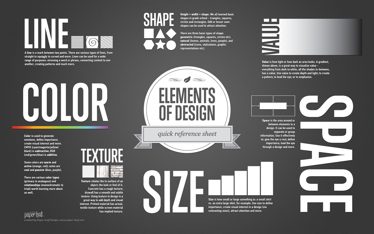
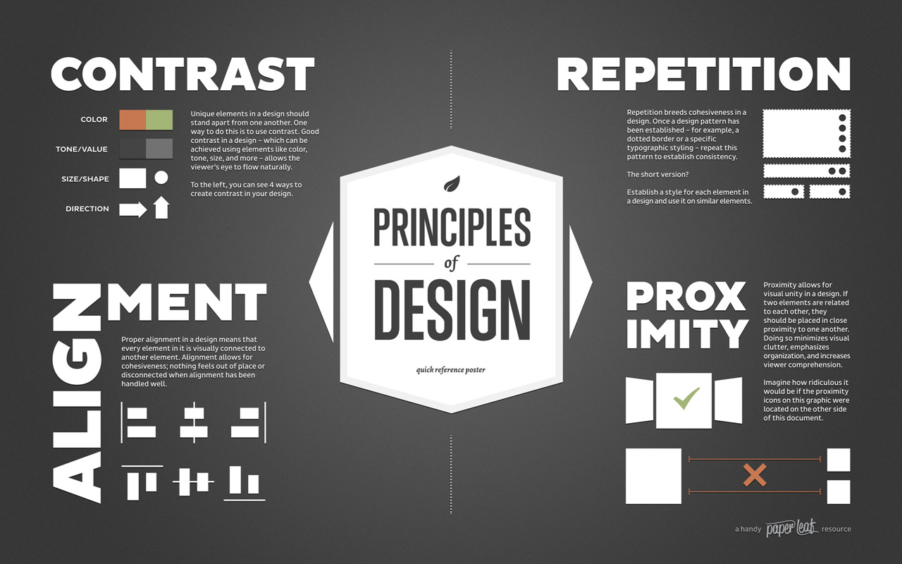
- The best infographics leverage principles and elements of graphic design to tell their stories. These principles show up both at the macro level-- What does the grid layout of your poster say about the relatioships between your figures?-- and also on the micro level-- How do the colors you've chosen for that one chart represent the contrast between categories?
- Canva has a nice overview of design elements and principles for reference.
- We've also created some resources, including a deep dive into color, if you want to dig deeper into specific elements:
3. Helpful Links
- Why Infographics?: An infographic about the effectiveness of infographics
- Types of Infographics: An overview of somep common infographic formats with templates
- Pinterest of Design Principles
- datasketches: Some beautiful data-driven graphics and notes on the process behind them for inspiration
- The Noun Project: Database of free icons
- Explore color palettes: Adobe Color and Coolors and Colormind
Bonus: Why Infographics?
Infographics. They capture our attention with their bright colors and their, seemingly, simple messages. They are used for everything from publich health campaigns to instructions to putting together that bookshelf in a box you just bought. Because infographics are all about distilling information to a few key takeaways, you might think this makes them stronger as marketing devices than as a medium for academic communication, but infographics have a lot to offer social scientists.
If your data describes processes that take place in time or across space (so really any process), infographics can effectively communicate these progressions. Think about how much harder it is to give directions merely verbally than to pull out a Google map. There's a reason why we quickly reach for that map. Our brains process visual information more quickly and processing information both visually and verbally can lessen cognitive load. Using an infographic to convey your map-based data can allow you to leverage this visual processing.
Likewise processes of all types, whether human migrations or biochemical processes, are often cyclical or otherwise non-linear. Prose, on the other hand, is by nature linear. Why prose can describe non-linear relations, the only relation it can show is concatenation, one thing following another. Thus, prose isn't always ideally suited to capture the richness of the directionality of processes. Infographics, on the other hand, can leverage design elements like line and shape to literally show the viewer these extra dimensions.
Processes aside, infographics also allow you to leverage visual principles to perform many of the key "moves" of analysis you might perform in an essay. For example, grid layouts and hierarchies can be used to setup comparisons. Since prose alone only allows for sequential presentation of the events, places, people, etc. that you might compare, infographics as a medium have the advantage here. With an infographic you can literally place those objects side-by-side using design elements like alignment and shape to indicate similarity and color contrast and size to highlight difference.
Finally, the best infographics often read at diffent "levels". There's a gestalt that I as a viewer get in a quick glance. This is essential; if it's missing, I won't stop and give the infographic a second look. But this second look is where the infographic reveals its richness. Each shape, color, line, and placement is intentional and supports the argument. Thus, creating infographics benefits writers as well, presenting an opportunity to learn a new "grammar" for argumentation.