Key Color Terms
As we discuss color, it may be helpful to review the following terms:
Hue
Saturation
Value
Contrast
Color Palette
Achromatic Palettes
Monochromatic Palettes
The Color Wheel
Complementary Colors
Analogous Colors
Split Complementary Colors
Triadic Colors
Temperature
Hue
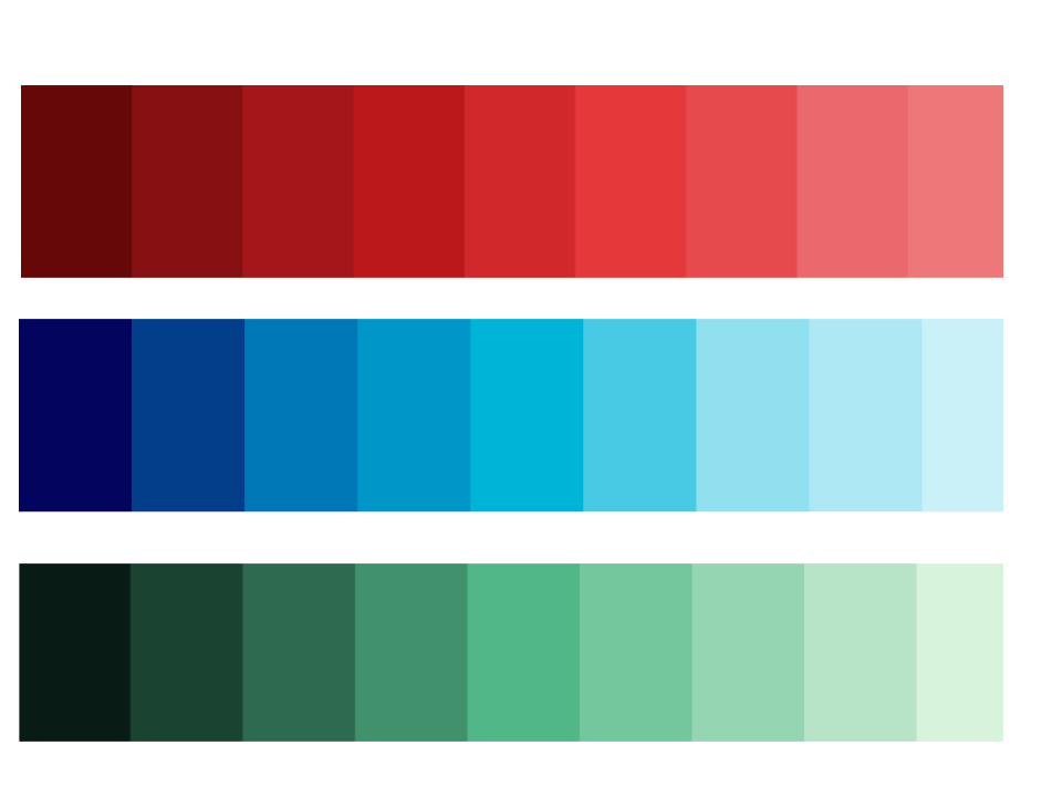
Hue is simply a word to describe the family a color belongs to (red, orange, yellow, green, blue, purple).
Above, we have three hues: red, blue, and green. However, in order to speak with specificity about a certain hue, we introduce the concepts of saturation and value.
Saturation
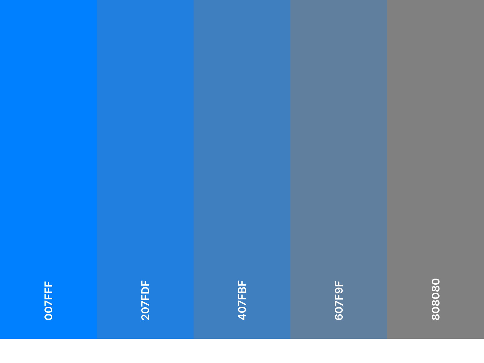
Saturation can be thought of as “color purity” or how much gray is in a color.
The more intense (or “colorful”) a color, the greater the saturation.
The more neutral (or gray), the lower the saturation.
The blue on the left (above) is the most highly saturated.
Value
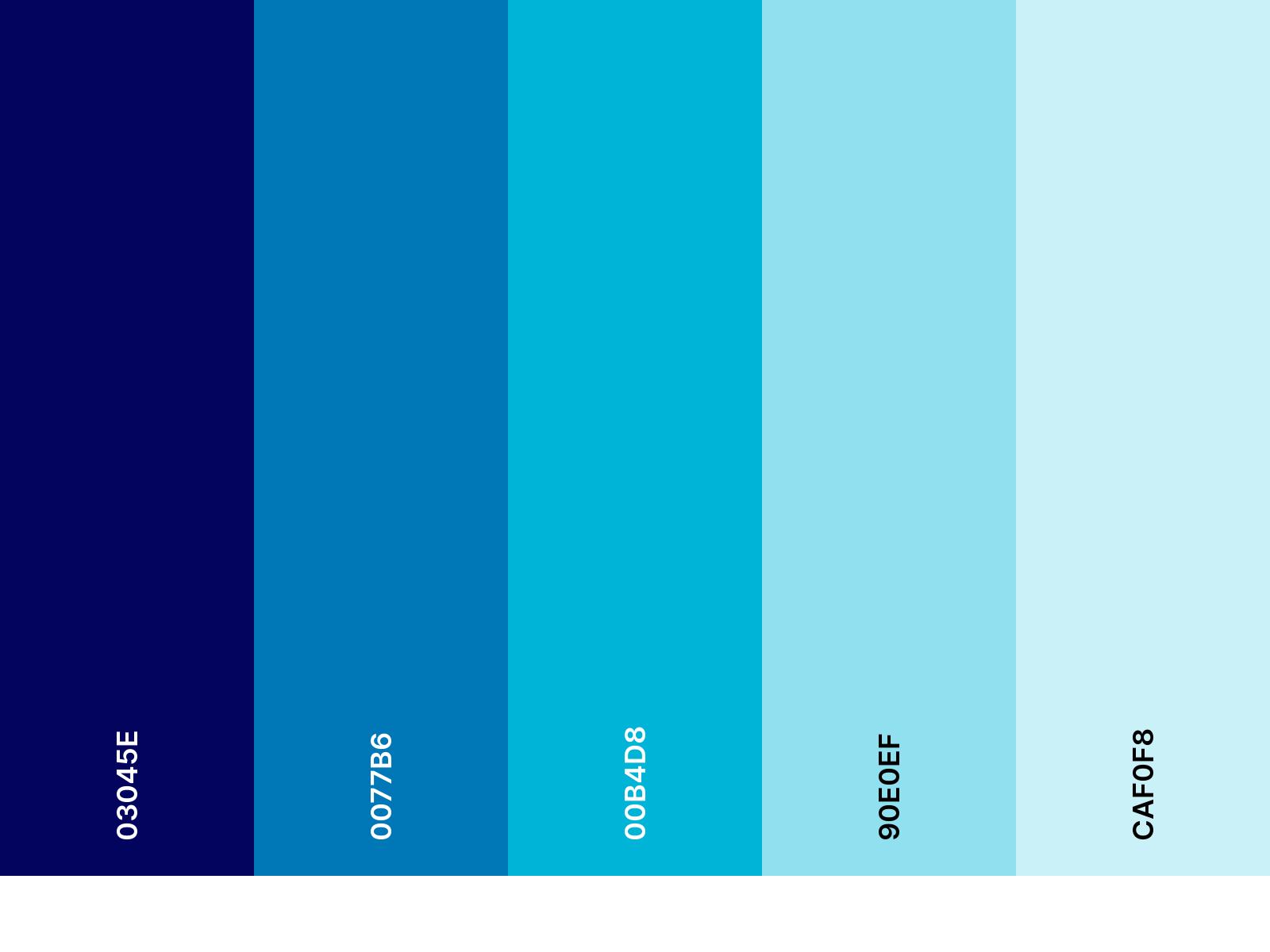
Value describes how light or dark a color is.
The closer to white a color is, the lighter its value. The closer to black, the darker its value is.
Contrast
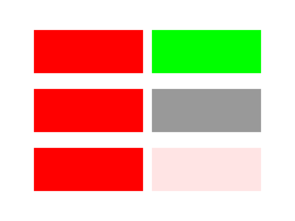
Contrast describes how similar or different two colors are from one another.
Colors can differ in hue, saturation, and value. High contrast attracts the viewer’s eye.
Above, the top pair of colors is high contrast in hue. The middle pair is high contrast in saturation. The bottom pair is high contrast in value.
Color Palette

Color Palette describes the main colors used in any visual composition.
In the image above of the Maldives, the color palette consists of mainly three colors: Blue, Green, and White.
Achromatic Palettes

Achromatic palettes are black, gray, and white. They include no color hues.
Monochromatic Palettes

Monochromatic palettes consist of only one hue, using its different tints, tones, and shades.
The Color Wheel

The color wheel is a useful tool for understanding color relationships and picking color palettes.
The color wheel contains all the hues of the rainbow.
Red, yellow, and blue are the three primary colors, from which all other colors can be created.
Orange, green, and purple are the three secondary colors, each positioned midway between two primary colors.
Six tertiary colors are positioned halfway between each primary and secondary color. Tertiary colors are named after the colors that were used to create them. For example, the color between yellow and green is called yellow-green.
Complementary Colors
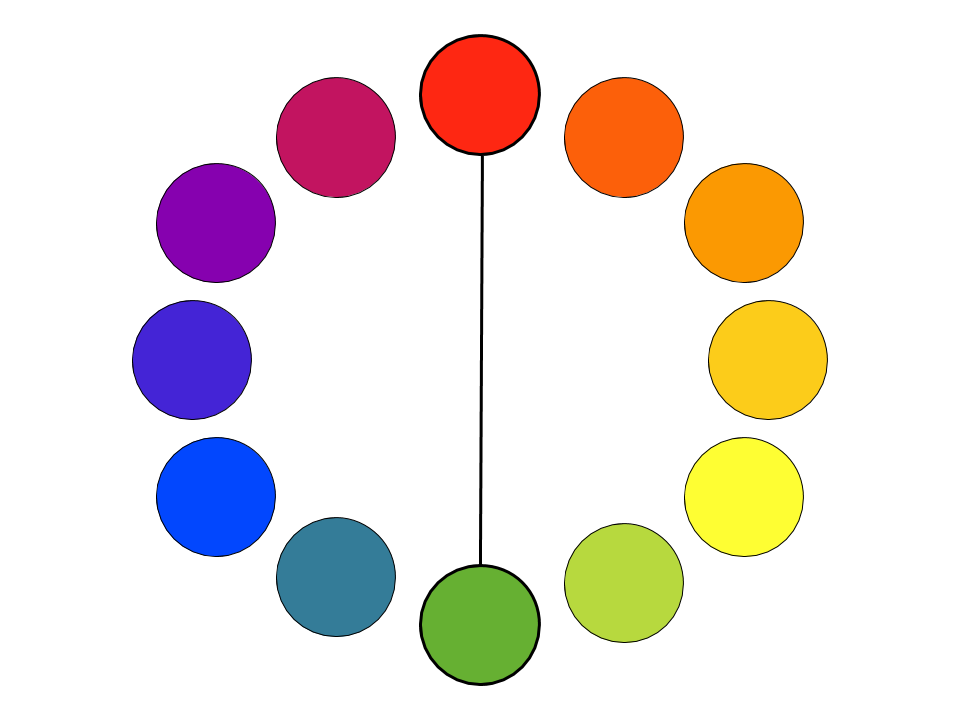
Complementary Colors are opposite one another on the color wheel.
When placed side by side, they tend to make one another pop.
Analogous Colors
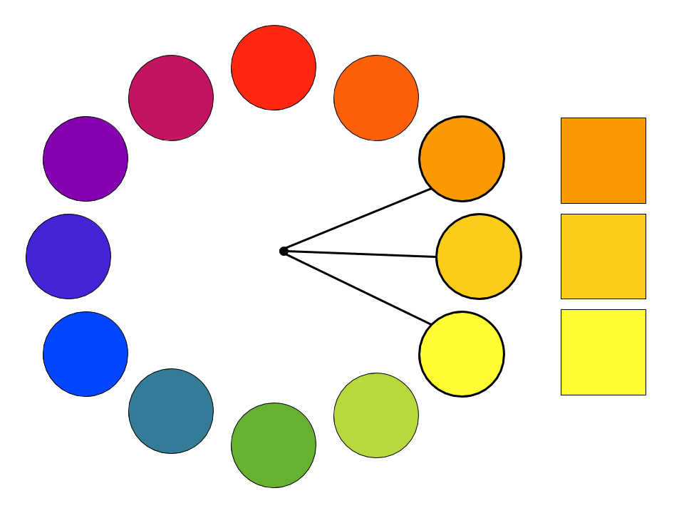
Analogous Colors are adjacent on the color wheel.
While complementary pairs imply tension, analogous colors have a calming effect.
Split Complementary Colors
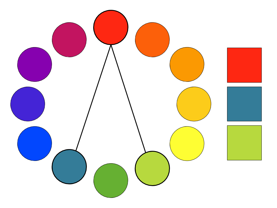
Split Complementary Colors consist of one color plus the two colors adjacent to the color’s complement.
They offer a strong visual contrast that is not quite as jarring as complementary colors.
In the example above to the right, the triad consists of red, blue-green, and yellow-green.
Triadic Colors
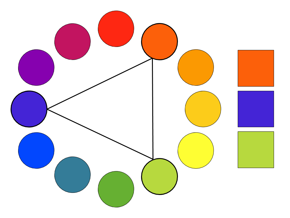
Triadic Colors are 3 colors spaced evenly on the color wheel.
Like complementary colors, triadic palettes can be intensely vibrant.
Temperature
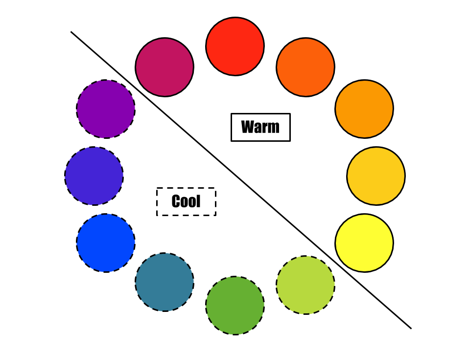
Temperature describes how “warm” or “cool” a color is.
Orange, red, and yellow are considered the warm colors.
Blue, green, and purple are cool colors.
Warmer colors attract the viewer’s attention.