Highlighting Information with Saturated Color
Saturation describes how bright or “pure” a color looks.
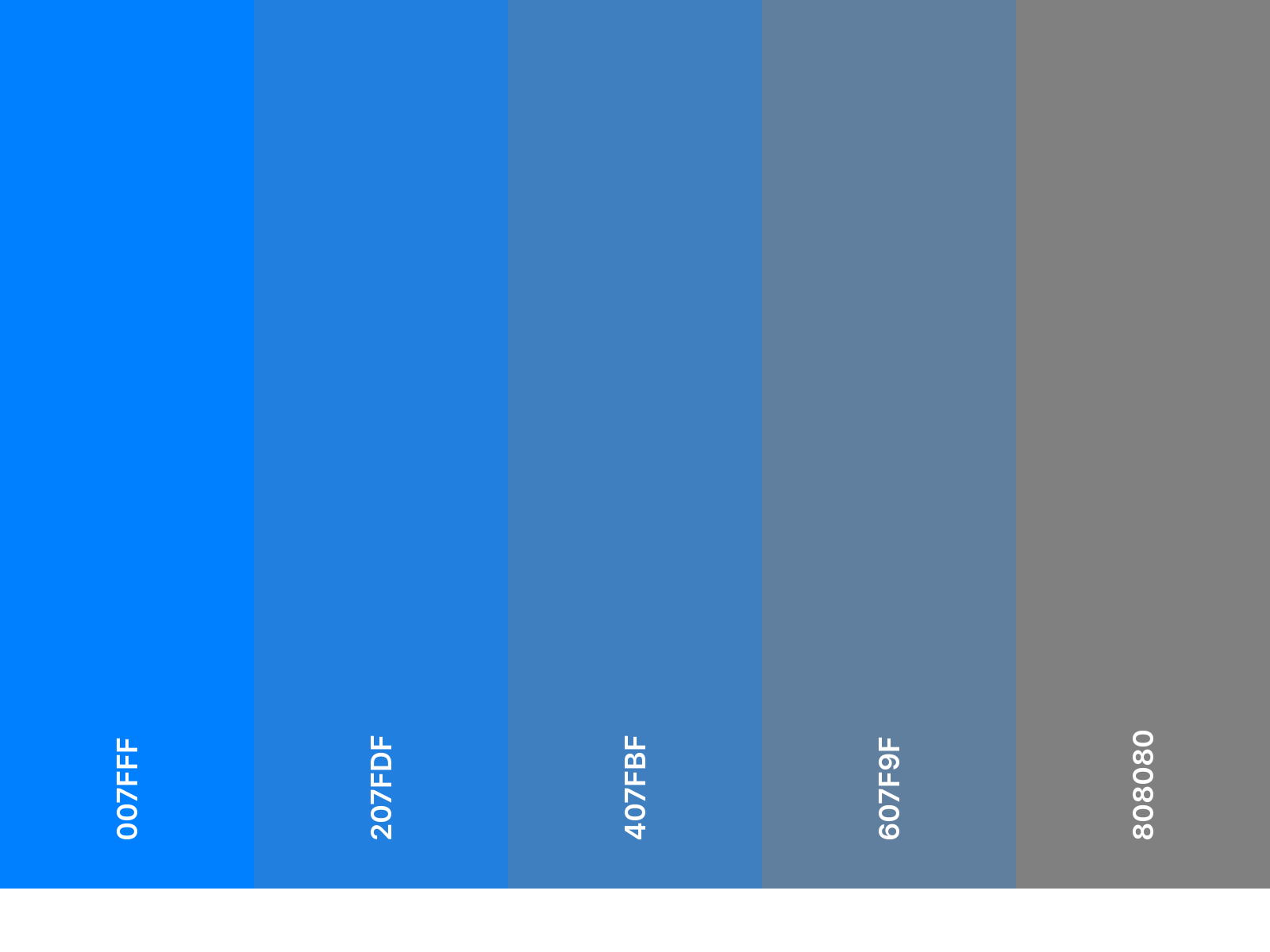 Above, the left is the fully saturated, and the right is fully desaturated.
The ink that comes out of a highlighter, for example, is fully saturated.
In fact, you can use fully saturated colors as if they were highlighters - to direct the viewer’s attention to the most significant parts of your drawing.
Below, in René Magritte’s surrealist painting, The Banquette, our eyes are immediately attracted to the fully saturated red circle set against a desaturated background. The saturated sun pops against the desaturated trees, providing the painting with a clear focal point.

But remember, less is more.
Use too many colors, and the highlighted areas become meaningless.
In Andy Warhol’s pop art painting, Colored Campbell’s Soup Cans, no area of the composition appears any more significant than any other. Our eyes dart to and fro, unsure where to settle.

Takeaways
Ask yourself what area of your visual explanation you want viewers to encounter first, and consider using color contrast to make that element the focal point of your drawing.
If one element of the drawing is particularly important, consider depicting that element in a fully saturated color set against dull or neutral colors.

The saturation principle is at play in this iconic still of the little girl in the red dress from the film, Schindler’s List. In this shot, Spielberg desaturates the entire image except for the girl’s red coat, drawing the viewer’s attention to the little girl.
Practice Exercise 1
 Map 1
Map 1
In the top map of World War I, subtle color differences are used to communicate countries’ allegiances, while the major battles points are indicated by fully saturated red blasts.
Like Magritte’s sun, the major battle points pop against the muted background.
Map 2
In the bottom map of the same war, different color choices were made. All the colors are similarly saturated.

With a partner, compare the two maps.
- In which map are the battles easier to see? Why?
- In which map are the countries’ allegiances easier to see? Why?
- Which map do you prefer? Does your answer change depending on which information is more important? How so?
- How might you redesign a map to communicate the battles points and the country allegiances more clearly?
Teaching Guide for Practice Exercise 1
1. In which map are the battles easier to see? Why?
Battles are easier to see in the first map because they are depicted in a fully saturated color set against a desaturated background.
2. In which map are the countries’ allegiances easier to see? Why?
Country borders are easier to see in the second map because they are depicted in more fully saturated colors. They are harder to see in the first map because they are desaturated. By definition, desaturating a color brings that color closer to gray. Therefore, if we desaturate all the colors in an image, those colors all start to look very similar.
3. Which map do you prefer? Does your answer change depending on which information is more important? How so?
Aesthetic preferences are personal. Students opinions may vary. However, they should understand that the mapmaker’s choices should be informed by his/her goals. If the map was primarily intended to communicate battle locations, then the first map would be preferable.
4. How might you redesign a map to communicate the battles points and the country allegiances more clearly?
There are many options. Some include:
- Use fully saturated red to depict the battles. Use tints (light versions) of colors to depict the countries.
- Use fully saturated red to depict the battles. Use grayscale to depict the countries (light gray, medium gray, dark gray).
Practice Exercise 2
There are two diagrams below, one in color, the other in grayscale.
Discuss the following questions with a partner:
- Which diagram do you prefer?
- Is one diagram easier to follow?
- Is the red merely decorative, or does it support your comprehension? If so, how?
- Does the color work better in some places than in others?


Design Challenge:
If you were to redesign this diagram, is there anything you would change? Would additional colors support or detract from your comprehension?
Teaching Guide for Practice Exercise 2
- Which diagram do you prefer?
Answers may vary.
- Is one diagram easier to follow?
Most students should select the colorful diagram.
- Is the red merely decorative, or does it support your comprehension? If so, how?
The red is not merely decorative. Meaning is embedded in the color. There are actually three colors in the first diagram -- red, black, and white -- and each color means something. White means background. Black is used for text, outlines, and cell DNA. Red is used to fill the cells, and to show the viral RNA and DNA.
In the second diagram, there are also three colors: black, white and gray. Red has been desaturated, or replaced, by gray. Since it is harder to see the differences between gray and black than it is to tell the difference between red and black, the first diagram is easier to read.
In particular, it is easier to differentiate the viral RNA, viral DNA, and cell DNA in the first diagram. When the color is removed from the diagram, it becomes difficult to tell the difference between the three types of DNA. It is possible to differentiate in the black and white diagram because the DNA is depicted with bumpy lines and the RNA with smooth lines, and the viral DNA is thicker. Nevertheless, it is much easier in the red diagram.
- Does the color work better in some places than in others?
Students may say that the color is most helpful in differentiating Cell DNA from virus DNA and RNA because the Cell DNA is depicted in black. However, if the color “red” is being used to represent everything related to the virus, then it is somewhat confusing that the cell is filled in with a reddish-pink color. Also, Viral DNA and Viral RNA still look very similar to one another because they are the exact same color.
- If you were to redesign this diagram, is there anything you would change?
Have students consider depicting viral DNA, viral RNA, and cell DNA in three different colors. In selecting those colors, ask students to determine what should stand out the most, and use colors choices to make sure that those elements pop. Have students consider what happens when they change the color of the cell body or remove the color.
- Would additional colors support or detract from your comprehension?
Additional colors would support comprehension. It would be easier to tell the difference between viral DNA, viral RNA, and cell DNA if different colors were used.