Differentiating Information with Color Triads
When you need to differentiate between three parts of a drawing, consider using color triads.
There are triadic, split-complementary, and analogous color triads.
Triadic
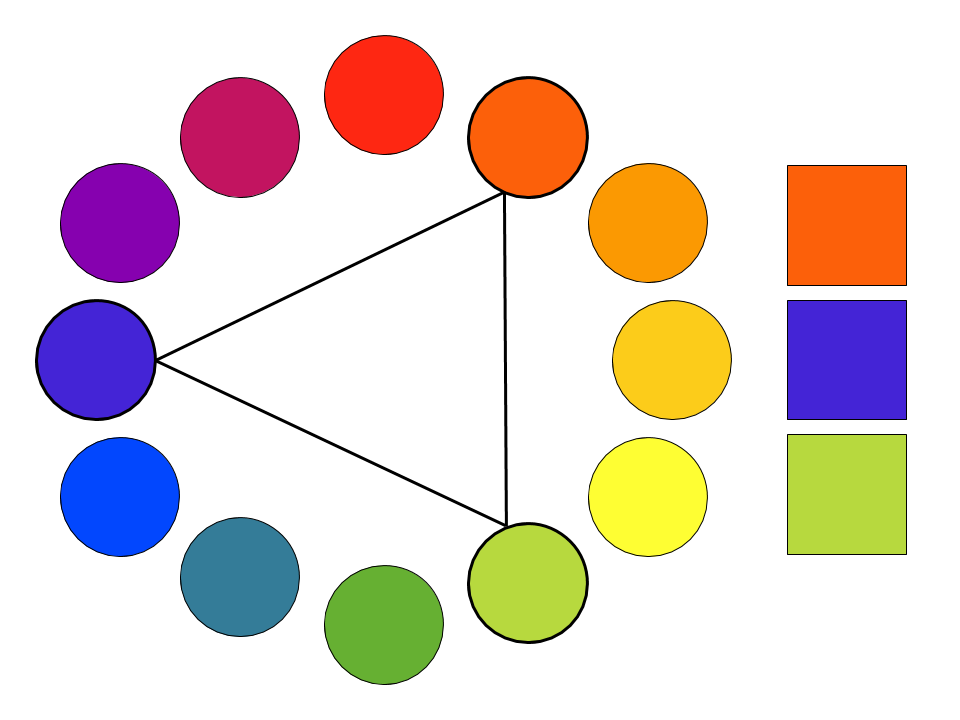
Triadic Colors are spaced evenly on the color wheel. Like complementary colors, triadic palettes can be intensely vibrant.
Consider using triadic colors when you want to distinguish between three equally important elements in a drawing. Alternatively, you may let one or two colors dominate and use the other color(s) sparingly.
Split Complimentary
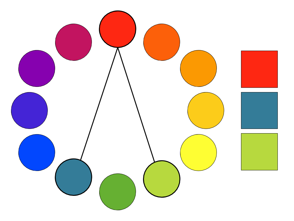
Split Complementary Colors consist of one color plus the two colors adjacent to the color’s complement.
If your drawing has three parts and one part is more important than the other two, consider using the two adjacent colors to represent the less significant elements of the drawing.
Analogous
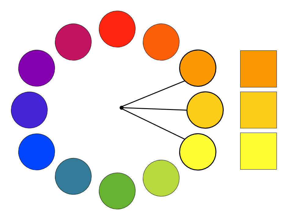
Analogous Colors are adjacent on the color wheel. While complementary pairs imply tension, analogous colors have a calming effect.
Use two or more analogous colors to distinguish between elements in your drawing when the elements are not in opposition to one another.
Beware of using analogous colors when your main goal is to distinguish between elements (such as in a bar graph). Sometimes, it can make sense to use several analogous colors plus one non-analogous color.
Takeaways
If your drawing has three main elements, consider using a color triad to differentiate between the elements.
If the relationship between those elements is dynamic and you want all three colors to pop, consider using a triadic palette.
When you need to emphasize one key part of your drawing or have that element “pop,” consider using a split-complementary palette.
If the relationship is harmonious, consider using an analogous palette.
Triads appear frequently in fine art.

Pop artist, Roy Lichtenstein, uses his iconic triadic primary color palette in In the Car above.

Pre-Raphaelite painter, John William Waterhouse, employs a split-complementary palette in The Soul of the Rose above.

Abstract expressionist, Mark Rothko, explores analogous colors in his painting, Orange and Yellow above.
Triads in photographs
Here are color palettes from six of Time Magazine’s Top 100 Photos of 2014, along with the captions that accompany them in the publication:


Resources for Picking Color Palettes
A few websites to inspire you and help you select color palettes:
Practice Exercise
Find two photographs, one that uses a color palette you find attractive and one that you find unattractive. Using colored pencils, paint, oil sticks, or photoshop, replicate the main 3 - 6 colors in each photograph. Bring the photographs and the color swatches with you to class.
Share your colors swatches with a partner and discuss the following questions:
- Which color schemes do each of your palettes most closely align with: complementary, split-complementary, analogous, or triadic? None of the above?
- How saturated are the colors in your palette? How do their values compare?
- What do you like about the attractive palette? Does your partner share your aesthetic?
- What don’t you like about the unattractive palette? How might you turn it into a palette you do like?
- Which colors stand out the most? Which colors don’t draw attention? How might you use these palettes in your own visual explanations?